This 2015 study by The Design Management Institute found that design-focused businesses saw 219% more returns than non-design-focused companies between 2004-2014 as the design is incredibly important for business.. This article will point out 10 things that many small businesses get wrong when it comes to design, and we’ll give you suggestions to avoid them. In business, especially small business, design usually isn’t prioritized like sales, customer service, and finances.
Graphic design is a method of communication and a huge part of your brand. Often times, your company’s graphics are people’s first impression of your business, and it can communicate your business’s brand either effectively or poorly.
In our years of helping small and large businesses create compelling design, we’ve noticed some common mistakes. Some of these mistakes are with the design itself, and some of them are with how the designs are formatted:
1) Overly complex
When it comes to graphic design, less is more. This is especially true when it comes to your logo. When you meet someone at a party, it’s probably not a good idea to try and tell someone your life story before they can get their name out. The same is true with your logo. If you’re trying to fit your business name, core values, and a nod to your favorite sports team in your logo, you might be trying to cover too much ground. You want your logo to be a simple introduction of your brand, and make the viewer want to know more. Negative space or “white space” is the space around a design. Negative space is important for any design, and helps draw your attention to the important parts. If you try and fill up negative space with too many details, things can get messy. This is even more important for signage – you want people to understand the primary message of the sign as quickly as possible , from as great a distance as possible; sometimes while they’re driving.
2) Non-vector logos
There are a lot of different image files out there these days, and it can be hard to keep up with what’s what, but when you are working with a designer to create a logo, it’s extremely important to create that logo as a vector file. A vector file can be blown up or stretched out to any size without losing quality. That way, you can put your logo on an ink pen, or a billboard, without it getting blurry. 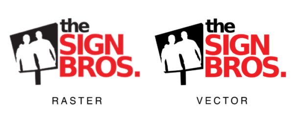 Here are some common vector file types: ai, eps, pdf (sometimes) Here are some common non-vector (raster) file types: jpg, png, gif When designing brand collateral, make sure it’s designed as one of the file types in the first list and not the second.
3) Drop Shadows
 Drop shadows may not look bad, and they work fine for non-vector images, but when you’re working with vector graphics, drop shadows are incredibly difficult to deal with. Save your designer some time and yourself some money, and steer clear of drop shadows in your brand’s designs.
4) Lack of originality
Coming up with something new is difficult. Some businesses get around this by just finding a design that they like and copying it. This is a bad decision in the long run. Even if it isn’t a copyright issue, you don’t want people to conflate your brand with another; you want your brand to stand out and be recognizable. If you’re having trouble coming up with something, try and find a few logos that you like and identify specific traits about them that you like, and communicate those to your designer so that they can incorporate those traits into an original design.
5) Meaningless Buzzwords
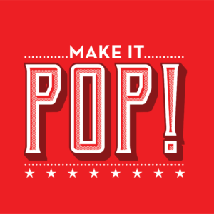 Telling a designer that you want your design to “pop” doesn’t give her clear direction. When giving a designer initial input, and/or feedback, it’s important not to use subjective buzzwords. Try and use specific adjectives, or if you’re struggling, find some examples of designs you like, or don’t like.
6) Confusing “Brand IDENTITY” and “logo”
While a logo is an incredibly important part of a brand identity, they are two very different things. Before you task someone with creating a logo, make sure that you define your brand first. A complete brand identity includes guidelines like colors, typefaces, style guides, and more. Once you have your identity ironed out, it’s much easier to create a logo. You’ll be much more likely to create something that accurately represents the company you are trying to build. If you don’t create your guidelines first, your logo may get stuck in places that don’t make it look very good.
7) Design by committee
Since design is so subjective, the more opinions involved in the design process, the slower it goes, and it doesn’t take many people to stop a design project in its tracks. Having one primary (and qualified) decision maker responsible for communicating with the designer will help the process move quickly, and ensure a quality end product.
8) Under- or over-communicating
Whoever you hire to do your company’s design, it is incredibly important for you to trust her with the job, and give her the information she needs. A good designer will have the perceptive skills needed to understand your company, and she will fit her designs to match your company identity. Of course, it will likely require significant communication from both parties. The value of a good designer isn’t just in her ability to follow directions, but in her consultative expertise that can help create a design with a unique, effective perspective.
9) Bad font and color choice
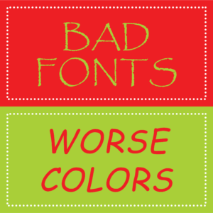 While graphic design is subjective, there are certain fonts and color combinations that just don’t work well in the vast majority of cases. There are some fonts that have been overused to the point of becoming a cliche. Fonts like Papyrus, Comic Sans, and Curlz MT have been virtually blacklisted from professional design. A few other fonts that have been overused as well: Times New Roman, Arial, and Courier New. Decorative and handwritten fonts, try to mimic cursive and calligraphy style text, and often end up falling short. Here’s more information about cliche fonts (and why you shouldn’t use them). If you like these fonts, chances are that there is a less cliché font out there that has a similar look.
When it comes to colors, using bright/overly-contrasting colors can give the viewer a headache. For example, using red text on a blue background creates an effect called “vibration,” and it should be avoided. Similarly, putting colors that are too similar next to each other can be just as ineffective, for example, light green text on a light blue background, or orange text on a yellow background. If you don’t already have clearly defined brand fonts and colors, make sure to get your designers’ input on the best color combinations and fonts to fit your company.
10) Not knowing the target audience
Your branding and design should reflect the values of your target audience. The logo of a finance company should communicate something very different than the logo of a wedding planner, or a grocery store. Before you start designing anything, you should make sure you know who you are designing it for. Are they mostly middle-aged? Young professionals? parents of toddlers? And just as important, you need to define what your audience wants to see in your company. An outdoor apparel company and a personal finance company may both be targeting young professionals, but those young professionals are going to look for very different things in each of those companies. Knowing if your company’s brand is traditional or modern, professional or relaxed, etc. will help you make effective design decisions.
Conclusion
Design is an incredibly important part of your brand and your business. It’s important that your business’s brand is clearly communicated and positively received by your target audience. No matter who you choose to design brand materials for your business, remembering to avoid these pitfalls will help ensure a great final product.
No comments yet. You should be kind and add one!
Our apologies, you must be logged in to post a comment.